PuTTY has its options and main functions in one window

Problems

PuTTY is a great little utility that comes handy when trying to connect to Unix computers from Windows machines. The GUI hasn’t changed for many years. Even though it doesn’t have many functions (just connect), it has a confusing user interface. Albeit when you get used to it, you don’t even think about the initial steep learning curve. The first screen as shown below is pretty much all the functionality of the application:

  • Connect using different protocols (Raw, Telnet, RLogin, RRS, Serial)
  • Load/Save the connection

Unfortunately a lot of options are put in the interface in a confusing manner. That big tree structure on the left represents a list of options available for configuring certain connection parameters. When the user first runs PuTTY, he or she will be wandering around trying to figure out how to connect.

Also some of these options prove to be really critical so if you are one of those users who learn by trying things, you don’t want to mess with options in PuTTY.

Another issue is the load/save function. It is a little bit hard to get. I recommend downloading PuTTY and trying it. It doesn’t need installation. This is basically how it works:

  • Save: type a session name in the “Saved Sessions” (it’s not saved yet, though! weird name) and press “Save” button
  • Load: select an element from the list and press “Load” button (it doesn’t load when you click and select and item!)

Solutions

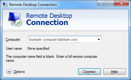
There is a lot to learn from a native Windows application which can be roughly considered as the graphical version of PuTTY: Windows Remote Desktop. Let’s take a look:

The first page is pretty simple and focused on the functionality of the application: to connect. So if you just want to connect, you type the destination address and then press the “Connect” button. Of course if it fails or you want to change some settings, you can press the “Options” button. Also some help if available if you are interested. This is what happens when Options is clicked:

I suggest PuTTY to have the same first page as Windows Remote Desktop. However, I suggest putting all the options under another dialogue and show it when the user clicks “Options” button. The application functionality and options dialogue box should be separated.

I also suggest adding a help button (it can lead to an online help). There is not a lack of space in the GUI of PuTTY. There is enough space for “About”, so there can be space for “Help” as well. In Help the user can learn about the basics of PuTTY and how to take advantage of the various connection options.

For the load/save functionality, Windows Remote Desktop again has some lessons to learn. The “Save” and “Open” button on the first page let the user know about what they can save (it would be better if those buttons are put right under the Logon Settings to show this is what they save or open). Please pay attention that these buttons are not visible by default in Widnows Remote Desktop and the user has to press the “Options” button to see them. That’s not logical. They are not part of the options.

This is the wireframe of my suggestion for the function dialogue (first screen when running PuTTY):

And this is a suggestion for the options dialogue:

The tabs are sorted in the order of importance. Please note that the options dialogue has the standard OK, Cancel and Apply buttons just like any other standard Windows application. And finally here is a suggestion to allow loading and saving the configuration from the main screen. The open and save would look nice with icons. If verbs “Open” and “Save” are written on the button caption, they should end up with “…” because of Windows naming conventions for actions that open another dialogue.

Note

I contacted PuTTY development team and here is what one of them replied:

…PuTTY is generally used by technical people for a wide variety of purposes and they often need to be able to get at a wide variety of options quickly.  I’m sure there would be complaints if we hid the options away in a sub-dialogue box; it would certainly make it more awkward for _me_ to use…

Another developer added:

…the fact that all the _most commonly used_ controls are on the front page is a feature, not a bug. I don’t disagree that this somewhat hurts usability concerns such as discoverability and conceptual coherence, but there is a compensatory element of convenience to the experienced user…

This is how Electronic Arts wants to hire top-notch experts

Problems

Electronic Arts uses a website for hiring their staff. One may expect a company with 3.5$ Billion revenue in 2011 (ref) does it best to make sure to have a welcoming portal for hiring top-notch experts. One might be wrong! There are countless number of usability issues with the website. Let’s see some of them:

1. There are two apply buttons (marked as A and B in the below snapshot). but the upper one (A) doesn’t work!

2. The list of jobs is really long and there are many similar items in different places in the list. The prospective job applicant should go through the whole list to find quite similar items. Let’s see what a web designer may look for:

  • Online User Experience Designer (as a user experience designer for online applications)
  • IT Application Architect (as in information architect for applications)
  • Software Engineer Web Developer (maybe a web designer in a software engineer?)

3. When choosing the country the “State/Province” combo box appears. Now it may sound good for countries like United States or Canada which their states are in the database. But for a country like Sweden or Germany, the list of states don’t show anything but “(Not Applicable)”. Then why show it?

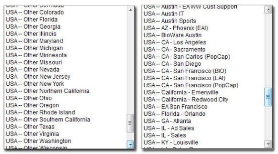
4. Same problem as number 2 happens when choosing preferred work locations. if you are a flexible person, there is no option to say “Anywhere in California” or “Anywhere in Sweden”. Let’s say you want to work in San Francisco. Which one should you choose?

  • USA — CA– San Francisco (BIO)
  • USA — CA– San Francisco (EAI)
  • USA — CA– San Francisco (Pop Cap)
  • USA — EA San Francisco (BIO)  (Hint: EA is not a valid State code!)
Just to make it worse there is a bunch of states listed under “Other”.
5. There is no place to upload a cover letter! As stupid as it may sound, you should hope that human resource managers at Electronic Arts will figure out how your Resume is related to the job application. Cover Letters are an important part of any professional application package. But all the time and effort to writing one for a specific position is wasted with this online recruitment software.

6. After uploading your resume, you are not allowed to correct it. Let’s say you uploaded the wrong file: no chance to correct! Human Resource hasn’t still seen it, but you don’t have a chance to fix the error. You cannot even download your current resume and check it. Once submitted, you have to wait 24 hours!

7. After submitting the application, the website shows the form with some “Required” red text. It takes a few more presses of the “Save Profile” button to understand that this is just a confirmation page! Unlike the resume upload page (number 6), this page is quite generous and gives you an opportunity to edit the submitted data but now it’s the wrong time.

There are many more errors, but these are the annoying ones for a user who uses the site for the very first time. I should confess it was a very bad first impression. Not sure if the HR will even see my partially incomplete application. It doesn’t even have a cover letter so why should they contact me? I wish I would embed my cover letter in the same document as the Resume. But then it’s logically wrong because the resume upload page didn’t say the cover letter is some sort of resume! Anyway, let’s see some solutions.

Solutions

1. This one is easy to fix. Looking at the HTML code of the page, there is a big canvas covering the upper button. That’s why it’s not clickable (see the image below). Remove the canvas or reduce its height, or give a higher z-index to the button.

2. This is a simple information architecture issue. Take some time to categorize jobs into maximum 7 categories and put the job titles in those categories. User doesn’t need to read all the jobs (including a long list of sales, accounting and irrelevant job titles) to find the one he or she might be interested to. Read more in the solution to number 4.

3. Don’t show the list of states for the countries that are “Not Applicable”!

4. Why not use a standard format like “COUNTRY – STATE NAME – CITY NAME”?

Or even better have a 3-level combo box: one for country, one for state and one for city and one for selecting multiple offices in the same city. User can choose “Any” on each of the combo boxes. In this case the combo boxes below the one with “Any” in it will be disabled. That way the user can choose “Anywhere in the world”, “Anywhere in the United States”, “Anywhere in California”, “Anywhere in San Francisco” or even choose a specific office location.

5. Allow the user to upload a cover letter for every job they apply for. The resume can be shared among several jobs (if the user applies for multiple jobs at the same time), but the cover letter should be different for each job opportunity. Let the user be heard why they choose a certain job position and how they think they fit the position. I’ll not be surprised if the HR doesn’t even read the Resume and easily dismisses a good potential employee just because of this bad portal.

6. What is the reason for now allowing the user to upload another resume till the next 24 hours? Microsoft allows that, Google allows that, Apple allows that. Does EA have a special security condition? if yes, use a captcha.

7. Instead of showing the form again, show a simple brief success message like “Your application is submitted successfully and you will be informed as soon as we process it”. If you want to be really nice, put a “see application” link so that the user can make sure that he or she has applied for the right position, what documents are submitted and what is the current processing situation of the job application.

Inconsistency in a basic function of Adobe package

Problem

Many designers are familiar with Adobe Creative Suit software package. it is comprised of a set of design tools that are sold together (something like Microsoft Office but for the designers): Photoshop, Dreamweaver, Illustrator, Flash, etc.

But despite of being parts of one package, many things are different among these programs. For example the Undo function is usually Ctrl+Z (on Windows) but Photoshop’s undo only has one level. If you want to do an undo like the other software in this package you have to use the rather hard to press Alt+Ctrl+Z for this common and basic functionality.

Here are some pictures from the software in Adobe CS5.5. The good thing about the undo feature of most of them is that they mention the type of action that is going to be undone. But Dreamweaver is an exception to this role!

Image

It’s also good to mention that the Redo function has a different key combination in some of them!

Solution

When releasing software as a package it is important to respect consistency. I suggest changing Alt+Ctrl+Z in Photoshop to Ctrl+Z and use another key combination for Step Backward. I also suggest Ctrl+Y for Redo function in all of them. At least these two keys are standard key combinations in most software.

Read more: Guidelines for keyboard user interface design (Windows)

Note

Look at the order of “Edit” and “View” menus in the above pictures. Probably this level of inconsistency in such a professional product exists because different independent teams work on each product and no one is responsible to check their integration. However designers typically work with more than one of these software at the same time. That is why they are sold in a package! Adobe knows that. Yet it doesn’t try to give a unified user experience to its designers. They may argue that these pieces of software come from different companies (Adobe bought Micromedia a few years ago), but that’s not a valid excuse to keep the new generation of designers confused.

Does anyone read popups?

Problem

Recently the number of websites that use popup dialogues to do a survey or ask for your email address is on the raise. Here is an example from androidadvice.com:

Image

I can’t remember the last time I actually took a second to read one of them, but the real design issue here is when users go to a website, they want to access information as soon as possible. I the designer (or marketing team) think they can force the user to read something this way, they are wrong. There is a reason that pop-up blockers are embedded in the browsers: they are annoying! A workaround is as bad as the old popup mechanisms.

Solution

Simply remove any sort of popup. Some websites use timed popups, so that they distract the user after a few seconds of accessing the information. It’s even worse because it distracts the user after they are engaged in an activity (reading the page) and the chances are even higher that they only look for the close button… hey! A new idea: put the message where the close button should be! Never! It breaks the consistency and users will hate you for such mean tricks.

Put the message (whatever it is) in the page. Imagine you had to deal with a popup for every page you visit on the Internet. That’s not an ideal world, is it?

Is it updating or advertising?

Problem

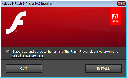
You’re probably familiar with this screen:

With every new release Adobe shows this dialogue on your screen expecting you to tick that check-box and press the install button. If you have several computers you have to deal with this dialogue on all those computers every time a new update is ready. But recently Adobe has increased the frequency of these updates so it’s really becoming a unnecessary, annoying distraction. Just looking at how the screen real estate is used in the above dialogue, one can conclude that more than 50% of the dialogue is used for the logo and branding. Can it be that Adobe is using this dialogue as an advertisement?

Solution

Put a little check box that reads like: “Update automatically to the future releases” and let the software upgrade in the background! After all, Flash is not the reason many people use their computer. Google Chrome does a good job when updating! Many people even don’t know what is their Google Chrome version number. They don’t need to! They just focus on what matters: browsing.

Note

Java suffered from the same poor design in its updating process. Guess what? Many people (including me) uninstall it after we see the annoying update message. I used to be a Java programmer, nevertheless I don’t have time to update the JRE with every new minor release. Flash however is still more practical in a day to day browsing experience, so uninstalling it is not a wise choice now.

Update

Today (2012-04-02) after updating Flash, I was presented with this dialog box that shows Adobe now cares more about the user experience of the update procedure:

Adobe Flash auto-update dialogue

Does MSDN care about consistency?

Problem

Microsoft Developer Network (MSDN) is a great information for developers to learn about technologies. It even has some guides about interaction design for Windows and web. But does the site itself has a good usability? Just a simple browsing on its tabs show an obvious consistency issue:

Some tabs are wider, some are narrow. Some have “Metro” style buttons some don’t. Some tabs even have a different colors and feel like a totally different website.

Solution

Design one template and follow it strictly all around the website. The solution sounds simpler than applying it. That’s because of the nature of the website. MSDN is a huge source of information. I remember in the old time we had to buy MSDN CDs and install it on the computer. But data volume is no excuse for Microsoft. Specially on its website for educating developers. Quite an irony, isn’t it?

Reaper has options you never even read

Problem

Before I start, let me ask one question: which software is more complex, an operating system or a music editing software? Hint: operating system has more than 1 GB binary code and this music software is under 10MB!

Reaper is a lovely piece of software if you’re looking for an affordable commercial tool for editing music at home. I have used it for a week now and I’m going to buy it. But this tiny piece of code is too customizable. In fact it has so many options that I still haven’t had time to go through all of them and see what they are, let alone trying them and see what different combinations do! Let’s see some of the pages in the options dialogue box:

Did you notice that the options tree on the left is so huge that the user needs to scroll it? Imagine each of those pages are as complicated as the few images above! Something is wrong: too much text, too little space between items, long options and the help is inside the dialogues indeed! The options dialogue of Reaper is so complicated that it has a search feature (quite weirdly it’s positioned on the bottom left instead of top right).

Do you think you’ve seen enough options in this dialogue? Just see the options menu itself:

OK, back to the question I asked at the beginning of this post. I don’t think in the entire operating system you can find a dialogue box as complex as the options for reaper. Even if you find, the size and complexity of the operating system may justify so many options. Most of the options in Reaper’s options dialogue are not used by average user or even beginners like me. Reaper is not the best music editing software in the market. It cannot even show a sheet music. Its pricing and feature set seems to be targeted to amateur users like me. Yet it manages to confuse me with so many options (but I’m going to buy it anyway because it’s cheap and it has a few things that my favorite open source software Sekaiju doesn’t have).

Either Reaper is bragging about the flexibility of its software or it got the design wrong.

Solutions

First of all, if the options dialogue is going to change just a little bit, I suggest making the dialogue bigger and letting some space between the options. A little study on readability might help.

Second suggestion is to add beautiful icons to each dialogue (and possibly their corresponding tree node on the left) to give life to it. Users remember icons and colors easier.

A very big improvement can be to categorize options into basic and advanced mode. Let the amateur users access the basic crucial options and if an advanced user wants something that is not available in the basic mode, they know where to find it. I would be glad to see only 20% of all these options in the basic mode.

Another suggestion is to shorten the text and take a minimalist approach. Remove all the text that doesn’t make a direct added value. Let the “help” text reside in a help menu or even tooltip. Keep it brief and neat.

And the last suggestion is to review these options and merge the ones that are similar.