New Youtube look-ahead feature has a narrow mouse response area

Problem

Earlier this month Youtube introduced a really handy feature that allows you to look ahead in the video without actually jumping to that part. It looks something like this:

The new Youtube look-ahead feature

Video: http://youtu.be/e7K3fWTuA0o

It’s hard to criticize a design from Google engineers. In fact one of my design inspirations is Google’s user experience guidelines. However, in this particular case, the user is expected to have strictly narrow mouse movements. In fact if the mouse cursor moves outside the area highlighted with green color in the image below, the thumbnail disappears:

The mouse movement area for look-ahead thumbnail preview

This may sound trivial but it’s a big frustration because it’s not very easy to move the mouse in such a narrow rectangle. As a comparison: you can grab the position knob and move the mouse anywhere on the screen. The knob moves in parallel with the horizontal position of the mouse.

In longer videos, Youtube pops up a new positioning control which doesn’t have this problem:

Youtube's positioning controls for longer videos

Video: http://youtu.be/JaFVr_cJJIY

Solution

A bigger response area would be great. I suggest the following area which extends from the positioning bar till the top of  where a thumbnail appears:

Suggested response area for the look-ahead feature

Here is how it works:

  • No thumbnail is shown at the beginning when the video is just loaded.
  • If mouse reaches the positioning bar, the thumbnail appears.
  • As long as mouse is in the area highlighted by green area, the thumbnail is shown.
  • When mouse escapes this area, the thumbnail disappears.

I believe Youtube UX engineers will fix it (I’m going to send this suggestion to them as well) because they got it right for another similar feature: when you hold the positioning knob it shows a timeline of more thumbnails together and that has even a bigger response area: the whole video:

Mouse response area for when holding the knob

Yamaha keyboard has only 1 button to explore 17 functions

Problem

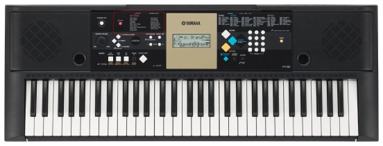
Yamaha YPT-220 just like many similar keyboards from Yamaha has one important button called “Function” (see picture below). It should actually be labeled “settings” or “configure” or “options” because it sets various parameters to control how the keyboard works. This is the single most important button in the user interface of this device after the power button.

Everytime the user presses this button, the name of the current parameter appears in the monochrome LCD screen and the user can use the + and – button to set the parameter or press + and – together to reset the value of the parameter to its factory default.

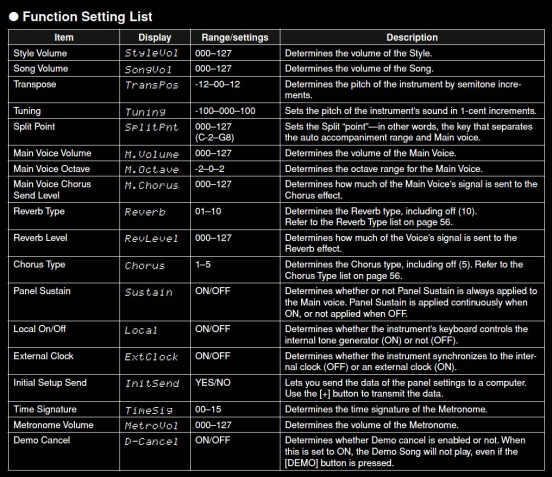
Unfortunately it is very hard to use this type of setting. First of all there is a mapping problem. Different settings are all under the same button. There is also a navigation problem. User doesn’t know what is the next option coming when the “Function” button is pressed. In Yamaha YPT-220 there are 17 different options that can be set using this button:

If the user passes one desired option on mistake, he has to press the “Function” button 16 more times to reach that menu again! Moreover if he wants to set a specific parameter like “Panel Sustain”, he has to press the “Function” button repeatedly and every time read the LCD display carefully not to pass that menu. In other words the setting navigation doesn’t show a big picture of the current location. Of course the user can memorize these 17 items, but is it really a reasonable expectation from the designers?

One reason for this mess is because unlike digital interfaces, adding a new button to a device physically makes it more expensive. Yamaha designers probably wanted to keep the production price low and have a minimal user interface.

Solution

Here are a few possible alternatives to solve the navigation and mapping problem:

1. The simplest one is to add a list of parameters on the body of the keyboard. There are already 3 lists there: songs, voices and styles. There is empty space on the left side of the display that can be used for this purpose and the “Function” button better be replaced near this list and be called “Settings”. It’s good to color code the header just like the other lists. See the mockup below:

2. There can be one button for each option. This is the best option from the mapping point of view but is 17 times more expensive. It is not very flexible from the software perspective. If in the future a new parameter is added to the software, a new button should be added physically to support this interaction model. Moreover it is not a minimalist design.

3. When holding the “Function” button, user can browse through options using + and – keys. This is not very intuitive because + and – at the same time are used for adjusting the value of the parameters. But it solves the annoying button-presses to reach a menu you have already passed.

Note

I tried to contact Yamaha about this issue, but quite surprisingly I found out that Yamaha has totally shut the door for any technical ideas:

Yamaha doesn't accept technical ideas