Problem
Recently Google has added a built-in translation feature to Chrome that has some usability issues. Since these issues haven’t been fixed in the past couple of releases, they might be here to stay. So here is how it works: if you visit a page that is in a different language than your system language (or the main Chrome language), Chrome shows that little popup in the image below and asks if you would like to translate the page. Neat feature if you occasionally use it. However that is not the case when you often visit pages with another language. By the way, there’s a joke that goes like this:
What do you call a person who knows three languages? Answer: Trilingual. What do you call a person who knows two languages? Answer: Bilingual. What do you call a person who knows only one language? Answer: American.
So probably “Americans” designed Chrome but for the rest of the world, this is just a painful UX.

Why U visit pages in other languages?
Let’s demonstrate with an example. Baidu is one of the most popular search engines in China. When you go to www.baidu.com you just want to start typing in the search box. This is a standard behavior in www.google.com. Many people do it almost mechanically without even looking at the screen. However the translation popup gains the focus and doesn’t let you type. You have to click “Nope” or press “Esc” key on the keyboard so that the page regains the focus and you can type again. Note: as one reader reported, while the popup is open many other keyboard combinations on the browser level don’t work either. For example CTRL+W doesn’t close the tab.

Baidu in English Google Chrome
Unfortunately this awesome language aid creates a bad user experience on many websites. The only options that are available for preventing this UX issue is to disable translation on the entire site or for that particular language altogether. But that’s not good if for example you are learning that language and still want to have some help when you need it. Besides there is a hidden tax: Chrome analyses every page upon load to guess its language and see if it needs translation. This costs an extra CPU usage and battery life for every single page (not a good thing on mobile devices). If you click “Nope” and visit the page again (or just refresh it), the stupid popup is going to ask you the same question again like you never rejected it a few seconds ago. Yup! Computers are stubborn, specially when programmed carelessly. It’s ironic that in an age where popup blockers are a built-in feature of the web browsers, they return even more annoying. Check out the comments on this post and Hacker News to see that people have actually left Chrome for its rivals just because of these UX issues.
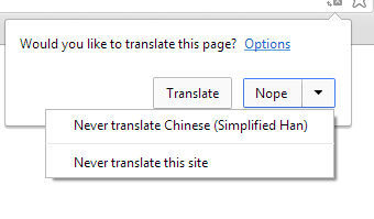
Never translate this site or language
Another examples: Try searching prices on prisjukt.nu (Sweden’t Pricerunner) and you have to pay that popup tax before you can do anything on the page. This annoyance appears in almost every interactive website that is in another language.
Reminder
The UX wasn’t better before. There was a yellow bar at the top of the screen that asked if you want to have the page translated. This made the page jump a little to the bottom (to make space for that yellow bar) right after it was loaded. This visible jump was annoying. For example if you were going to click a button or link before Chrome found out that this page is in a different language, the page would jump right before you click the button. This special sequence of events may not sound very likely but has happens a lot. For example when a user is a regular visitor, his/her brain remembers where to click (for example navigation bar, menu or links) but this sudden jump makes it harder for the motoric part of the interaction and slows it down. This creates the perception that Chrome is slow even though it was just the language detection feature that took place after the page was loaded. The new interaction model with popup solves that problem. However the yellow bar still exists on the Chrome for mobile browsers (Chrome UX designers figured there was something off with it, so they changed its color to white probably to make it less distracting! Didn’t it help?).

Chrome mobile translate
Solution
Add an option to disable this proactive popup approach.

Let the users choose if they want automatic translation
There is a similar setting under Settings > Languages (hidden under advanced settings):

Chrome Settings > Languages
This checkbox can be selected by default to comply with the current behavior of Google Chrome (occasional users of this feature will not be bothered to leave it selected). But when the user deselects this checkbox, Chrome should give up on guessing the page language every single time. Though the translation icon will be right there if it’s needed (see image below):

The translation feature is still there
If the user chooses “Nope” on a page, please remember this answer and don’t ask on every single load. The popup has a little tiny arrow at its top that makes it clear where it is coming from. User will be able to translate the page when needed. If usability tests show otherwise, add a “translate” menu item to the page menu right after “Find…”.

The translate menu in Google Chrome
PS. one of the readers kindly suggested that such workaround already exists on Chrome. All you have to do is to disable translation altogether (using the aforementioned Settings > Advanced Settings > Languages) and whenever you want to translate a page, just right click and choose the translate menu item as shown below:

Chrome has a page-wide translation menu already
What is your experience with Google Chrome’s translate feature?
PS. If you’re from Google, take a look at the comments in Hacker News and help us reach the right people to fix this problem.
Google’s Response
This post got a lot of attention (10,000+ views) and fortunately it was noticed by Google engineers. Here is their comment:
I’m Kenji Baheux on the Chrome team and have been overseeing this feature with our UX team.
Please accept my apologies for the trouble. We’ve been listening and are making the following changes:
1. we won’t show the infobubble and rely on the omnibox icon if the focus is on an editable field. https://crbug.com/313100 (fixed in M36)
2. the infobubble will stop stealing the focus: you will be able to type, perform shortcuts, scroll the page and so on.https://crbug.com/378643
3. we are experimenting with the idea of never showing the infobubble again and solely rely on the omnibox icon as soon as we observe more than X negative actions within a given timeframe T (starting with X=2; T=24h) https://crbug.com/379035
4. A few other adjustments around the “translated” infobubble (e.g. will not be shown for automatic translation, will not show up if the “translating” infobubble has been dismissed).https://crbug.com/319628
I’m eager to hear additional feedback and would appreciate if you could play with the feature in Canary as we land the different changes.